选择器
选择器分组
元素1,元素2,元素3{属性;}派生(后代)选择器
元素1 分级n{属性;}(选择可以跨级)子元素选择器
元素1>分级1{属性;}(只能选择到下一级)相邻兄弟选择器 (了解)
元素1+元素2{属性;}(被选择的元素必须具有前者元素)
id选择器
#id{属性;}类选择器
.class{属性;}属性(和值)选择器(在head中加入)
1
2
3
[元素属性]{属性1;}/*含有目标属性*/
[元素属性=特定值]{属性2;}/*目标属性为特定值*/
[元素属性~=特定值]{属性3;}/*目标属性的值中包含有特定值*/通用配置符
*{属性;}多类选择器
1
2
3
4
/*css文件*/
.p1{属性1;}
.p2{属性2;}
.p2.p3{属性3;}1
2
3
4
5/*html文件*/
<p class="p1"></p>
<p class="p2"></p>
<p class="p1 p2"></p>
/*第三个段落属性为"属性1+属性2+属性3"*/
附:
元素选择器可与类选择器结合使用
a.class{属性}即a元素中class类的属性ID选择器与类选择器区别:
ID选择器只能在文档中使用一次,而类可以使用多次
ID选择器不能结合使用
当使用JS时需要用到ID
CSS样式
背景
| 属性 | 描述 |
|---|---|
| background-attachment | 背景图片是否随页面滚动 |
| background-color | 背景颜色 |
| background-image | 设置图片背景(url引入) |
| background-position | 起始位置(两项属性) |
| background-repeat | 是否及如何重复 |
| background-size | 图片尺寸 |
| background-origin | 图片定位区域 |
| background-clip | 图片绘制区域 |
文本
| 属性 | 描述 |
|---|---|
| color | 文本颜色 |
| direction | 文本方向 |
| line-height | 行高 |
| letter-spacing | 字符间距 |
| text-align | 对齐文本 |
| text-decoration | 文本修饰 |
| text-indent | 缩进文本首行 |
| text-transform | 元素字母(大小写) |
| unicode-bidi | 文本方向 |
| white-space | 空白处理方式 |
| word-spacing | 字间距 |
| text-shadow | 添加阴影 |
| word-wrap | 换行规则 |
text-shadow:四个属性(向右偏移 向下偏移 模糊程度 阴影颜色)
word-wrap:另外设置行宽度
字体
| 属性 | 描述 |
|---|---|
| font-family | 字体系列 |
| font-size | 字体尺寸 |
| font-style | 字体风格 |
| font-variant | 大小写或正常字体显示文本 |
| font-weight | 字体粗细 |
网络字体引入
1 | @font-face{ |
链接
链接四种状态:
| 元素 | 描述 |
|---|---|
| a:link | 普通未被访问的链接 |
| a:visited | 用户已访问的链接 |
| a:hover | 鼠标位于链接上方 |
| a:active | 鼠标被点击的时刻 |
链接样式:text-decoration
背景颜色:background-color
列表
| 属性 | 描述 |
|---|---|
| list-style | 简写列表项 |
| list-style-image | 列表项图像(引入) |
| list-style-position | 列表项标志位置 |
| list-style-type | 列表类型(普通图图表) |
表格
使用实例
1 | #tb{ |
轮廓
| 属性 | 描述 |
|---|---|
| outline | 轮廓属性 |
| outline-color | 轮廓颜色 |
| outline-style | 轮廓样式 |
| outline-width | 轮廓宽度 |
盒子模型
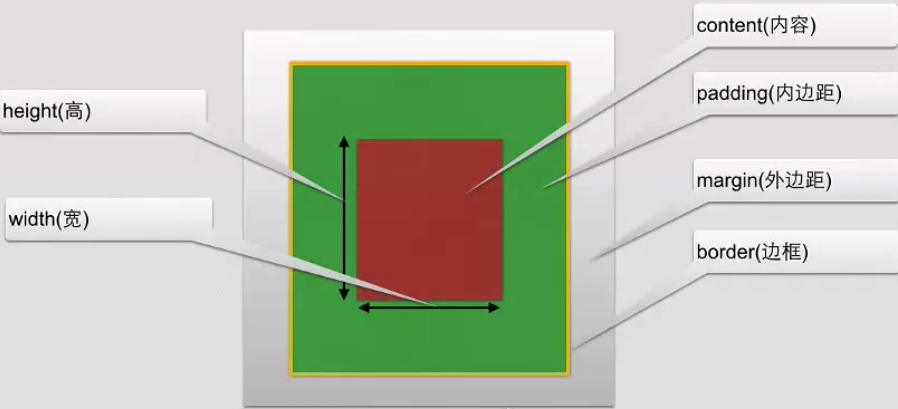
- padding-(): 设置边距
- border-()-style: 可设置具体方向边框
- border-()-width: 设置(单边)宽度
- border-()-color: 设置(单边)颜色
- border-radius: 圆角边框大小
- box-shadow: 阴影效果(属性格式同文字阴影)
- border-image: 边框图片
- margin-():设置边距
两个盒子模型的外边框会合并
盒子模型实际应用
1 | */*通用配置符*/{ |
定位&浮动
定位
| 属性 | 描述 |
|---|---|
| position | 元素位置形式 |
| top | 向上偏移量 |
| left | 向左偏移量 |
| right | 向右偏移量 |
| bottom | 向下偏移量 |
| overflow | 元素溢出区 |
| clip | 显示形状 |
| vertical-align | 对齐方式 |
| z-index | 堆叠顺序 |
浮动
float属性可用值:left right none inherit(从父级继承)
clear属性(清除浮动属性):left right both inherit
附: 通过浮动可作瀑布流效果
CSS常用操作
应用margin position float操作对齐边框
行高
line-height最大最小高宽度
max-width分类
属性 描述 clear 设置侧面是否允许其他浮动元素 cursor 指向某元素上是的鼠标指针类型 display 设置是否及如何显示元素 float 定义元素在哪个方向浮动 position 设置元素位置 visibility 设置元素是否可见 导航栏展示
1
2
3
4
5
6
7
8
9
10
11
12
13
14
15
16ul{
list-style-type: none;
margin: 0px;
padding: 0px;
}
a:link, a:visited/*a链接的状态*/{
text-decoration: none;
display: block;
background-color: burlywood;
color: aliceblue;
width: 50px;
text-align: center;
}
a:active, a: hover{
background-color: crimson;
}图片展示
1
2
3
4
5
6
7
8
9
10
11
12
13
14
15
16
17
18
19
20
21
22body{
margin: 10px auto;
width:70%;
height: auto;
background-color: burlywood;
}
.image{
border; 1px solid darkgray;
width: auto;
height:_auto;
float: left;
text-align: center;
margin: 5px;
}
img{
margin: 5px;
opacity: 1; /*透明度:0为完全透明,1为完全不透明*/
}
.text{
font-size: 12px
margin-bottom: 5px;
}
CSS动画
2D、3D转换
转换格式:
1 | transform:转换方法; |
2D转换方法:
| 方法 | 描述 |
|---|---|
| translate() | 移动 |
| rotate() | 旋转 |
| scale() | 缩放 |
| skew() | 倾斜 |
| matrix() | 矩阵 |
3D转换方法:
| 方法 | 描述 |
|---|---|
| rotateX() | X轴旋转 |
| rotateY() | Y轴旋转 |
过渡
| 属性 | 描述 |
|---|---|
| transition | 设置四个过渡属性 |
| transition-property | 过渡名称 |
| transition-duration | 过渡花费时间 |
| transition-timing-function | 过渡时间曲线 |
| transition-delay | 过渡开始时间 |
代码展示
1 | div{ |
动画
代码展示
1 | div{ |
多列
1 | .div1{ |
多列实现瀑布流(图片宽度一致)
1 | .container{ |
JS调整元素样式
1 | document.getElementById("noResourceImg").style.height = imgHeight + "px"; |